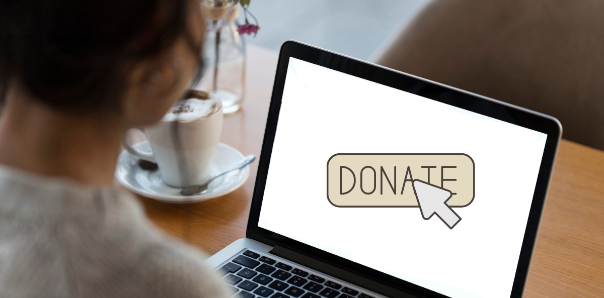
Most nonprofit websites aren’t as effective as they could be.
But there’s a good reason.
As Joan likes to say, nonprofits are messy. It’s in the DNA.
Frankly, when you have too many a lot of very passionate cooks in the kitchen; when you’re working on something very important with unmovable timelines; when every dollar you spend on a website is a dollar that doesn’t go directly to your programs… well… that leads to messy.
Add in the fact that few nonprofits have serious in-house digital expertise, and that mess translates to your website. Which impacts its effectiveness. Which means fewer donations, less advocacy, fewer people helped, less influence.
So what can you do about it? A lot, it turns out.
Here are four improvements your nonprofit can make to its website (along with examples) that, combined with a smart digital marketing plan, almost guarantee you better online results and an increase in online donations.
FIRST, ALLOW ME TO INTRODUCE MYSELF
You’ve probably noticed that I’m not Joan. Don’t worry – she hasn’t gone anywhere.
I’m Scott Paley, Joan’s long time business partner, and the co-founder of the Nonprofit Leadership Lab. Through my digital agency, Abstract Edge, I’ve helped nonprofit organizations build national and global movements and raise millions of dollars online over the past 25 years. Yeah, I’ve been at this a while.
Enough about me. Let’s get down to business…
IMPROVEMENT #1: SEE THROUGH YOUR VISITORS’ EYES
Ultimately, the goal of your website (usually) is to motivate people to take an action of some sort. That action could be tied to service delivery, to put pressure on politicians, to make a donation, etc.
Take a look at your website and ask yourself these two questions:
- What is its focus? Is it the structure of the organization? Or the actions visitors can take?
- Who is the website is meant for? Service recipients? Donors? Other supporters? Board members? Is it clear and obvious?
You might say, “Scott, our website is meant for multiple constituents. That’s part of what makes our website feel complicated!”
Fair enough. But an effective website has a primary audience. One beautiful thing about a website is that you can create as many different landing pages for as many different constituents as you want. Kind of like having a bunch of different home pages.
So choose one. Take a close look. Is the focus clear? Is it obvious whom the page is intended for?
If you were in need of services, does the website make it crystal clear how to do that? Does it trigger an emotional response that allows me to immediately understand, without having to think about it at all, why I should sign up to get services?
Or, if you wanted to support this mission, would you immediately understand why THIS is the organization you should support and why?
Does the site give people a strong feeling they can make a difference? Does it engender trust?
The website should be presented from the visitor’s point of view. What does he or she care about? Why is he or she there in the first place? It’s probably not to read an overview of “we do this” and “we do that.”
In other words… it’s not all about you!
To increase online donations, your aim must be to help them see how their self-interest aligns with the goals of your organization. Don’t make it about you. Make it about them.
Example: Feeding America
Feeding America’s homepage puts the focus squarely on those it helps – children who do not have enough to eat. It takes the point of view of the site visitor and what they are there to accomplish and is much less about Feeding America as an organization.
2: EMOTIONS FIRST, FACTS SECOND
There’s nothing that does a better job of inspiring and engaging than great storytelling. But why?
It’s just how human brains are wired. People take actions based on emotion, and then justify those actions based on logic.
This is especially true with preconceived notions – a process called “motivated reasoning” – where your brain acts like a high-priced lawyer, successfully and unconsciously convincing yourself that the objective facts support your beliefs. Motivated reasoning is a major reason why people are willing to fight tooth and nail to support their beliefs, even in the face of countering facts.
This insight can be used to your advantage on your website. In your messaging, think about what will push emotional buttons. What will trigger feelings like sympathy, outrage, loyalty, tribalism, caring, authority (pro or con), or humor? What language and visuals can you employ?
Studies clearly show that people are much more likely to donate when presented with a personal story rather than big group statistics. People identify with other people, not with abstractions. Make your stories individual, specific, and personal. Tell them well. Make them interesting, not wonky. Stories of your beneficiaries sets up emotional empathy. Stories about your supporters inspire action.
Example: Million Mom March
We saw this effect play out in a large way with gun control advocacy organization Million Mom March, our client, who was struggling with fundraising. So we created a “Tapestry of Woven Words” – a forum where people could express their thoughts and feelings. A high percentage of postings came from people who had lost a family member to gun violence.
On the same page we created the “Registry of Protected Children.” As people read the heartrending personal stories on the tapestry, they were given an opportunity to make a donation in the name of a specific child.
Did this increase online donations? Without question.
In fact, this proved to be the most successful and viral fundraising tactic on the site.
3: USE THE WEBSITE AS A FOOT IN THE DOOR
One of the oldest tricks salespeople know is that if you can get somebody to take an action, ANY action, you are much more likely to get them to take a second, bigger action.
This insight can be very useful for nonprofit websites. Getting site visitors to take simple actions like signing a petition, taking a poll, or subscribing to an email list is much simpler than getting them to make a donation, a much bigger commitment.
But once somebody has taken the smaller step they have taken the first step onto your “ladder of engagement.” It’s a lot easier to get somebody to take the second step than the first.
So don’t go right for the big ask.
If you want to increase online donations, date before getting married.
EXAMPLE: The Nature Conservancy
The Nature Conservancy’s website is designed to engage visitors gradually, starting with small, easy actions before leading to larger commitments.
4: LESS IS MORE
There’s always a temptation to cram in more options, more stories, more actions.
Nonprofits are particularly susceptible to this. It’s a consequence of having too many cooks in the web design kitchen.
Why limit what the visitor can do? Because when you give more than just a few options you run into the paradox of choice where people freeze and make no choice at all (or, rather, choose to leave your website entirely.)
This isn’t just about websites. A Columbia University study found that when it comes to company 401(k) retirement programs, the more fund options employees get, the less likely they are to sign up. This happens even when they would get extra matching funds from their employer!
Each additional action you offer on your website dilutes all the others. So clear prioritization is key. Remember, the more choices you give, the less valuable each choice is, relatively speaking. If your priority is to increase online donations, that needs to be your focus.
Also, remember that in general, people don’t read long text on websites – they scan. Instead of writing long blocks of text, use compelling headers, sub-headers, bullet lists, and images to make your point.
EXAMPLE: One
One’s homepage does a great job of focusing site visitors on just a few key action paths.
It’s certainly OK to have more than one. But you must prioritize the most important few and minimize the rest.
YOUR WEBSITE IS CRITICAL
A high-impact website can significantly boost your nonprofit’s online donations, inspire more people, and build your brand. For so many of those you want to reach, your website is your complete presence in the world. It’s your storefront, your help desk, your marketing hub, your service portal, your PR platform, your fundraising tool, and more… all rolled into one.
In other words, it’s really important.
That’s why I’m excited to share with you our upcoming 5-day workshop, “High-Impact Nonprofit Websites: Best Practices and Strategies,” starting Monday, August 19, 2024.
In just one week, you will learn to:
- Identify and address diverse audience needs: Learn how to effectively serve multiple stakeholders—donors, volunteers, beneficiaries, and more—while maintaining a clear and focused online presence.
- Strategically plan and optimize your website: Align your website objectives with your organization’s mission and strategic goals, identifying and optimizing key pages specific to your nonprofit sector to ensure a cohesive and purposeful online presence.
- Master content strategy and storytelling: Improve your storytelling skills to engage your audience emotionally and create a content plan that keeps your site fresh and relevant.
- Design for optimal user experience: Learn best practices for website design and user experience, ensuring your site is intuitive, accessible, and mobile-friendly.
- Manage and measure success: Gain insights into website maintenance, security, and using analytics to continuously improve your site’s performance. Plus, learn how to best work with web professionals, drawing from my 25 years of experience running a digital agency.
YOU ARE INVITED! HERE ARE THE DETAILS…
When is it?
Sessions are from 3 – 4 pm ET, August 19 – 23, 2024. Each session is 1 hour, filled with invaluable insights and expert advice.
What if I miss a session?
No worries! All recordings will be available soon after the live sessions for convenient viewing.
What does the workshop cost?
The cost is $149. However, it’s free for members of the Nonprofit Leadership Lab. If you’re not yet a member, you can join now and get the workshop for free.
Can my entire team participate?
Absolutely! We offer a special, highly-discounted group rate. Just email us at support@nonprofitleadershiplab.com for details.
Will there be a Q&A?
Yes, we’ve built in Q&A sessions to address your specific questions.
Sounds great! Where can I sign up?
The registration page has all the specific details, including a day-by-day breakdown.
I hope you’ll join us to transform your website and increase your impact!


